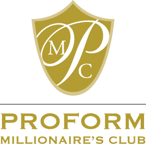
Full Color Version

Two Color Version


Objective:
National Gypsum was looking to design a logo that reflected the monumental achievement of selling one million units of their Proform product that looked classy and moved away from their old look which used a barrel of Proform and a common serif font. The client also requested the logo use gold as well as work in full black and white.
Solution:
To create something unique yet classic, I chose to incorporate a shield instead of the traditional laurels. This also served to give the logo more prominence by having a flood of color, thereby elevating it’s importance as a goal for employees to strive for. The client loved the direction that was taken and how well the logo fit within their given parameters.
