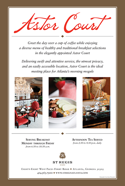
Poster

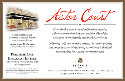
Postcard


Objective:
The client wanted to promote their new cafe through the use of posters and postcards that would be placed inside the hotel while maintaining the high-end atmosphere of the St. Regis brand.
Solution:
Due to the luxury nature of the hotel, I chose to use a burnished gold to give customers a sense of the atmosphere they have grown to expect from the St. Regis brand. To tie in the look with the overall branding, the diamond in the logo was strategically placed as a design element. The client was very pleased with the direction chosen to promote their new restaurant to their clientèle.
