Central Garden & Pet / Pennington Decor Team

Objective:
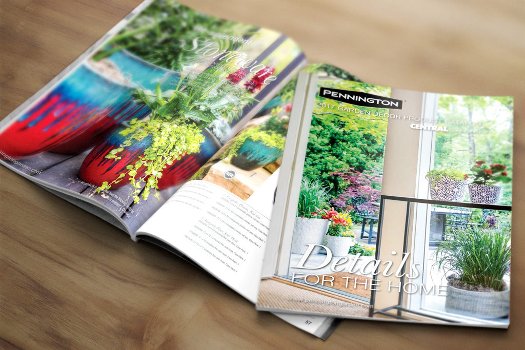
In prior years, the Décor Catalog used color blocks with very little lifestyle photography mixed in. The UPC barcodes were also found throughout the catalog and added a lot of bulk with little room for imagery. For the 2017 catalog, the team wanted to create something that invoked a feminine, softer feel similar to home decor catalogs through the use of carefully crafted lifestyle shots, color, font choices, and layout that still included the barcodes for the sales team.
Solution:
I landed on using one hero shot for each section of the catalog, such as Stoneware or Terracotta, with a brief introduction overlay on top. The barcodes were moved to the back of the catalog to allow several lifestyle images to flow through the main section of the catalog, and the descriptions were moved to be under or next to the pottery on each page. The overall look and feel is what the Décor team was looking for as the clean design allowed the images to sell the products.

